Below are some of the logos I have created for my short film 'Flight'. I have analysed the pros and cons of each, and have eventually decided upon my final logo. To help me create these, I researched logos from existing films . I feel that this research greatly helped the creation of the logos found below.
Logo Idea 1

I feel that this is an effective logo as it has many different appendixes extending from the different letters. This adds a sense of surrealism and fantasy which I want to be displayed as a theme throughout the production. This makes the logo stand out. The logo also holds a slightly worn effect. This I feel will be effective for my film as I want to show how the protagonist of the film is bored of her usual lifestyle. However, I feel that there are too many curls on this logo, and that perhaps the weighting could be thicker so that it is easier to read.
Logo Idea 2

This logo also holds many different curls flowing from the letters, which I think is effective in portraying themes which will be within the film. I like how large the 'F' is in comparison to the rest of the logo, as I feel that it will draw people's attention. However, I feel that the logo would need to be larger and thicker for it to portray a sense of realism.
Logo Idea 3
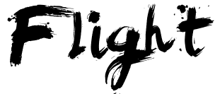
I like this logo as it has an artistic feel to it. It looks as though it has been created by a paint brush, due to the brush strokes and paint flicks which are shown. I like this as it is though it has been created by a character within the narrative itself. This also gives an impression of age, and suggests that the production will focus around a young person. However, I feel that the logo should be thinner, and that the letters should be placed closer together to show a surreal element.
Logo Idea 4

I feel that this font is effective as it looks as though it was hand-written. It could even be hinted at within the narrative that Sophie herself wrote it. I also like how the font is slightly slanted, and looks as though it has been hastily written. I also like how all of the letters, except for the beginning 'F', are connected.
Logo Idea 5

I feel that this logo is effective as it looks as though it has been written by a type-writer. I feel that this is edgy and inventive, as not many logos which I have researched possess this quality. I also like how the letters appear to be slightly worn, which will be representative of Sophie's lifestyle. However, I think that the letters could be placed closer together as I think that they are too spread out.
Final Logo
As a group we decided to use this logo, primarily due to the fact that the gracefulness of the font coincides with the dance sequence at the beginning of the film. We all felt that the fact that the logo looked hand-written was very effective and it more likely to involve the audience in our short film.
No comments:
Post a Comment