Tuesday 20 December 2011

Vimeo/Youtube Comparison

Youtube
Youtube is the most popular video-sharing website on the internet in the world. It allows anyone to upload videos from a wide range of video formats. This means that it is an extremely accessible platform to upload a wide range of films. Many short film makers use Youtube to distribute and exhibit their products, as it not only hosts videos, the website also allows people to communicate over the video through the commenting tool. This means that people can post comments on the actual video to ensure that they give the creator's opinion effectively. The owner of the video can then reply to these comments, and so on. This will mean that, upon redrafting the project, many different views and opinions can be given from the target audience of 'Flight' to ensure that it is the best quality it can possibly be. The quality of Youtube videos are also another advantage of using the hosting site. The clips can be viewed in HD, meaning that the viewer can view the footage in high quality and that they will be able to see everything within the frame without it being of a low quality. Youtube also allows clips to be exported directly onto social networking sites like Facebook and Twitter. This means that they can be shared with a wider audience and that many different people will have the access to see the footage which is being uploaded. Youtube allows users to annotate the clips uploaded. This means that they are able to communicate with the viewer about key scenes within the narrative. Furthermore, there are many channels on Youtube which are dedicated solely to short films. An example of this is the VirginMediaShorts channel, shown below. Each year the channel hosts a competition to find the best short film available. Users can upload their short film project onto the site to be entered into the competition. This means that by uploaded 'Flight' onto Youtube, I will be able to communicate with other short film fans via this channel to gain a wide range of insights into how the film can be improved.

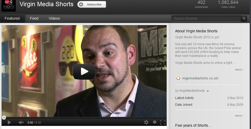
VirginMediaShort Youtube Channel.

Vimeo
The site Vimeo is another popular destination for film maker's to upload their footage. The website is solely based on creation, whereas Youtube has a wider range of products. This means that there may more of a response from videos on Vimeo, as the footage will be more accessible. Vimeo offers a higher quality service than Youtube, meaning that the viewers of the footage will be able to see all of the footage at ease, in the original format in which it is meant to be seen. This means that the video will be able to communicate mise-en-scene more effectively. Vimeo, like Youtube, allows clips to be shared onto a range of sites. However, the range of websites is very limited, especially when compared to Youtube. The website only offers the user an embed code, meaning that the clip may not be able to be shared on popular social networking sites like Tumblr and Twitter. This will have a negative effect on my production as I will not be able to gain as many views and opinions as if it was shown on Youtube. Vimeo has a lower storage allowance than Youtube, meaning that if I want to show many different drafts of the film, I may not be able to. If I use Youtube, however, then this may change. However, Vimeo does appeal to a more creative audience, as opposed to the amateur videos uploaded which have no relevance to the film industry.

A screen shot of a film on Vimeo.


Conclusion
In conclusion, I have decided that my short film 'Flight' will be uploaded onto the popular website Youtube. However, despite the fact that Vimeo appeals to a much more creative audience, I feel that Youtube will be the perfect destination for 'Flight' to be uploaded onto. This is because I will be able to gain a wide amount of views and opinions from users, which can then be used to shape the future re-drafts of my film. Youtube also has a larger storage capacity than Vimeo, which will benefit 'Flight' as I can upload many different drafts of my film, shaped by the feedback given to me by users. Feedback can also be more easily received from other social networking sites such as Tumblr and Twitter, which Youtube can connect to at ease.

Saturday 17 December 2011

Editing Short Film Analysis

Although I am the cinematographer for my short film, it is highly important that the length of shots is taken into consideration whilst I am shooting the shots required. The use of editing is just as important at conveying meaning to the audience as mise-en-scene, cinematography and sound, although it is more closely linked to cinematography. I will ensure that the editor of my group, Hannah, and I work closely together to ensure that the edited version of the shots I shoot conform to my desired vision. Due to the reasons listed above, I have decided to analysing the editing used within the short film 'Thoughts of a Dead Atheist'. This film has darker themes which link to the social realism genre, meaning that it will be beneficial to my own production for me to analyse, as it will outlay some of the social realism conventions which I may be expected to follow.

Above is the short film that I am going to analyse.

The opening shot of a film is arguably the most important of the whole production. This is because it immediately shows the viewer the themes which reside within the film, and introduce the protagonist to the audience. The opening shot of 'Thoughts of a Dead Atheist' lasts for an extremely long amount of time, amounting to a total of around 20 seconds. The character in the centre of the frame walks away from the camera down a narrow pathway in this amount of time. Although this shot looks visually appealing, and that it introduces the audience to the film effectively, I feel that this shot lasts for a too long duration of time. I will ensure that Hannah edits any of the longer shots I shoot to a smaller amount of time. This will keep audiences engaged with the production and will make them want to know what is going to happen next within the narrative. The following shot, where the man in question encounters another character, lasts for around 8 to 9 seconds. This shorter duration is more effective than the previous 20 second shot, as it keeps audiences engaged by showing them numerous different types of dialogue as the two characters exchange dialogue. Throughout the film shots of around 7 -8 seconds are used. I feel that some of the shots could have been reduced further, as some shots have little relevance to the meaning of the plot yet are shown anyway. This may result in audiences becoming bored whilst watching the short film, meaning that the overall effect of the production is ruined. To avoid this from happening, I will ensure that the shots within 'Flight' are only the necessary amount of time, and that the narrative progression does not drag on for too long. Another important aspect of editing is the use of altering the original colour of the shot. This is shown in the short film above by the use of black and white. However, the red scarf worn by one of the characters is still shown. This shows the importance of this character and hints at the connotations that the colour holds. I will ensure that I work closely with the editor of my film in case she decides to change any of the colour of the shots. We will work together to make sure that any colour alterations are effective.

Social Realism Cinematography Analysis

Fish Tank
Cinematography is a form of visual storytelling. As cinematographer for my short film 'Flight', I felt that it was necessary to conduct some research into the cinematography used within the social realism genre - within which my own film belongs. 'Fish Tank' is a social realist film focusing on the struggles of a young youth, named Mia, who aspired to be a dancer. Although there is no theme of drug culture within 'Fish Tank', it seems to share many of the same themes as my own film. Because of this, I decided to analyse some of the key moments of cinematography within the film, in the hope that it may inspire my own production. I decided to analyse the trailer for the film, shown on the Youtube video below, to gain an insight into what type of cinematography is used within the social realist genre.

Above is the video for the 'Fish Tank' trailer.


The shot shown above is an establishing shot. This effectively shows to the viewer the location within which the film is set. I feel that this is an effective shot as, not only is it visually appealing, but it shows the urbanised area within which Mia lives - the sink estate. It also shows the contrasting visual imagery of binary opposites - by showing the nature scene in the foreground and the urban location in the background. Upon creating my own film I will ensure that 'Flight' contains all of the necessary shots to convey to the audience where the narrative takes place. I will also consider the importance of binary opposites to convey meaning. This may prove to be especially important upon conveying the lifestyle choices that Sophie faces.


The shot shown above effectively shows the struggled lifestyle that Mia leads. The positioning of the frame is very effective, as Mia is shown to be directly in the centre, showing that she controls the progression of the narrative. The ambient lighting behind Mia also holds connotations about her character. The dark clouds with the strip of light behind Mia show that she is struggling to escape a troubled lifestyle. The theme of urbanisation is also effectively shown once more, with the long shot of the city beneath Mia. I will ensure that I used a wide range of nature shots to portray meaning, which will allow audiences to connect and understand my own protagonist effectively.


The next shot that I found to be both effective and visually appealing is the close up of Mia (shown above). The entire shot is purposely blurry, which I feel conveys the themes and the mental state of Mia effectively. The blurred shot represents Mia's confusion as to which path she should take. The blurred trees behind Mia represent the distance between herself and her primal roots. I feel that this effects the audience by allowing them to see the themes which reside within the film. When I create my own production, I will consider using the blurry technique to convey meaning to the audience. However, I may do this with the urban shots which are set within the town location. 


The long shot of the birds flying represents Mia's ambitions of freedom and 'flying away' from the lifestyle within which she currently resides. The colouring of this shot is relatively subdued, despite the blue sky. The way in which the birds move together is visually appealing and shows a binary opposite to the urban area where Mia lives. This shows that colour is an important aspect of cinematography and mise-en-scene as it can be used to portray the character's emotions within the narrative. 

Gone Goodbye
I then decided to conduct some research into a short film shared on the video-uploading site Youtube. Similarly to my Fish Tank analysis, I have picked out the key shots which convey the most effective form of meaning.

Above is the short film 'Gone Goodbye'.


I felt that this shot from the short film effectively conveyed the overall tone of the product. The subdued colours - mainly being dark green, brown and grey, show the isolation of the character in question. The framing of the shot is also effective, as it shows the protagonist being directly within the centre of the shot, despite the long shot meaning that it is difficult to locate him. This shows that he is still in control of the narrative, yet portrays his isolation. I will ensure that I use a similar technique within my own short film as Sophie loses control of her lifestyle. 


This shot continues with the theme of nature shown in the previous shot, yet shows the viewer a closer glimpse of the protagonist. This is the closest shot that we have seen of the character so far, and this occurred at 2:03. I feel that introducing the character earlier within the short film would heighten viewer interest more effectively. However, the mid shot of the man in the foreground and narrative being behind him also looks visually appealing.


The cinematography used in the shot is visually appealing. This is because the shot is divided into two distinct halves - the lake on the left, and the mountain with the man on the right. This shows an equal balance between the two entities, suggesting a balance between man and nature. Seeing as my own short film will deal with the ideas of binary opposites, I feel that using a division of screen framing may be an effective tool to use to convey the theme to the audience. The colour within this shot is also interesting, as the bright yellow balloon is the first thing that the viewer's eye is drawn towards. This takes away from the previous theme of nature dominance explored throughout the beginning section of the film. The yellow balloon also hints at freedom, as it is not tied down. 


Friday 16 December 2011

Exhibition of 'Flight'

'Flight' will be shown in independent cinemas, as opposed to being shown nationally in large multiplexes, like Vue, for example. This will mean the film being shown on around 30 - 60 screens. The local independent cinema in Kent is The Gulbenkian, otherwise known as Cinema 3, in Canterbury. Below is a screenshot of the film schedule of The Gulbenkian. The Gulbenkian is situated at the University of Kent, meaning that this will be ideal for our target audience, as it aimed at young people and students, as it deals with adult themes. As you can see they show specialist films as opposed to large American blockbusters, which will be the perfect platform to show my film.

The Gulbenkian's (independent cinema) schedule:

The films which are shown at 'The Gulbenkian' cinema not only include popular, English films, but also foreign films, located in Spain and France, for example. The cinema is also located near Canterbury Christ Church University and Kent University, meaning that Film and Media students may be interested in visiting the cinema to cast a critical eye over the films that they are showing. 'The Gulbenkian' also shows films which are not newly released, and have been in cinema for years, such as 'It's A Wonderful Life'. I feel that this is an advantage of the cinema as it allows people to view older films, yet still have the cinema experience.

Vue's (multiplex cinema) schedule:


As you can see, there is a vast difference between the types of films being shown at Cinema 3 and Vue. Vue offer a 3D option of screening, which Cinema 3 does not, yet my film will not be shot in 3D. The multiplex cinema, Vue, shows films which appeals to the fourth quadrant. However, 'Flight' will only appeal to a particular audience - young people who have an interest in drama films, so Vue would not be an appropriate screening choice.

The poster for 'Flight' will also be advertised at the cinema, as people who attend The Gulbenkian will most likely want to see similar films, and my short film falls into that category. This will entice people into seeing 'Flight' as it is more likely to relate to their interests, as opposed to if the poster was placed at a cinema like Vue. I will then proceed to locate the posters in appropriate areas near to the cinema.

The magazine review of 'Flight' will be placed in a specialist magazine such as 'Sight And Sound'. This magazine focuses on a large range of films, from independent, to large American blockbusters. The review being placed in a magazine like Empire would simply not be appropriate as they tend to focus on large, mainstream films which appeal to mass audiences. 'Sight And Sound', however, focuses on delivering articles which appeal to audiences who have a critical eye on films, and perhaps offer an expert view. The 'Sight And Sound' magazine is run by the BFI itself, which means that a large focus of what it covers will involve independent British film. Their reviews offer an opinion which the audience can relate to, yet go into a large amount of detail. The magazines also feature interviews with famous directors and producers, meaning that it appeals to avid fans of the film industry. Because of the fact that it focuses on a large range of films, and the fact that it appeals to critical audiences, we have decided to use 'Sight And Sound' for our magazine choice. 


Logo Ideas

Below are some of the logos I have created for my short film 'Flight'. I have analysed the pros and cons of each, and have eventually decided upon my final logo. To help me create these, I researched logos from existing films . I feel that this research greatly helped the creation of the logos found below.

Logo Idea 1

I feel that this is an effective logo as it has many different appendixes extending from the different letters. This adds a sense of surrealism and fantasy which I want to be displayed as a theme throughout the production. This makes the logo stand out. The logo also holds a slightly worn effect. This I feel will be effective for my film as I want to show how the protagonist of the film is bored of her usual lifestyle. However, I feel that there are too many curls on this logo, and that perhaps the weighting could be thicker so that it is easier to read.


Logo Idea 2

This logo also holds many different curls flowing from the letters, which I think is effective in portraying themes which will be within the film. I like how large the 'F' is in comparison to the rest of the logo, as I feel that it will draw people's attention. However, I feel that the logo would need to be larger and thicker for it to portray a sense of realism.


Logo Idea 3

I like this logo as it has an artistic feel to it. It looks as though it has been created by a paint brush, due to the brush strokes and paint flicks which are shown. I like this as it is though it has been created by a character within the narrative itself. This also gives an impression of age, and suggests that the production will focus around a young person. However, I feel that the logo should be thinner, and that the letters should be placed closer together to show a surreal element.

Logo Idea 4
I feel that this font is effective as it looks as though it was hand-written. It could even be hinted at within the narrative that Sophie herself wrote it. I also like how the font is slightly slanted, and looks as though it has been hastily written. I also like how all of the letters, except for the beginning 'F', are connected.


Logo Idea 5

I feel that this logo is effective as it looks as though it has been written by a type-writer. I feel that this is edgy and inventive, as not many logos which I have researched possess this quality. I also like how the letters appear to be slightly worn, which will be representative of Sophie's lifestyle. However, I think that the letters could be placed closer together as I think that they are too spread out.

Final Logo

As a group we decided to use this logo, primarily due to the fact that the gracefulness of the font coincides with the dance sequence at the beginning of the film. We all felt that the fact that the logo looked hand-written was very effective and it more likely to involve the audience in our short film.

Logo Analysis

I have decided to research and analyse different logos within the genre of film which I am producing. I feel that this will give me an idea of how films within the drama genre portray their logos. The logos which I am analysing are primarily shown on their posters as opposed to actually being within the film, although they could be used for both. Doing this research will enable me to conform or break the stereotypes portrayed when I create my logo for my own production.


Black Swan Logo Analysis


Above is the logo for the drama film 'Black Swan'. This film focuses on themes which are similar to my own production, such as a ballet dancer and the stress which the lifestyle brings. This is why I feel that analysing this logo will be beneficial in my research. I feel that the typography of this logo is quite effective, as the individual letters line up, reflecting the themes which are presented in the film of perfection. However, the logo does not grab my attention and is relatively plain, as it has no distinguishing features about it.


Fish Tank Logo Analysis


This is the logo for 'Fish Tank', which is also about an aspiring young dancer. The logo immediately suggests a sense of youth within the filming, giving the viewer an idea that the film will focus around a young person. This is shown through the use of bright blue and pink colours. The logo is in a sans-serif font, as it does not have any small appendixes coming out of the 'feet' of the letters. This shows that the film will be set in a modern time period. However, I feel that this logo is uninteresting as it lacks any interesting features which will make the audience remember it.


The Departed Logo Analysis

The colours used in this logo are very dark, a mixture of black, grey and blue. The font itself suggests that it will be set in a modern time period, due to the large block letters. The fact that the word 'The' is centred in the middle of the logo certainly draws attention to the film name, yet it almost looks messy and makes the logo difficult to read. However, this could be intentional and signify a sense of distortion, as suggested by the name of the film itself. The hole in the top left of the 'D', to me, suggests a bullet hole, emphasising a theme of violence which may run in the film. I feel that the colours used are effective in portraying genre.


War Of The Worlds Logo Analysis 


The film 'War Of The Worlds' does not focus on one character, but rather as the world as a whole on an epic scale. This I feel is reflected effectively in the logo of the film. Each of the words stands out, and almost appears as it is coming out of the screen at the viewer, involving them into the film before they've even seen it. The fact that the unimportant words - 'of the' are smaller is effective as it allows the audience to focus on the key words within the title. However, I feel that colour could have been used to portray more meaning, and perhaps the levelling of each of the words could have been moved to make the logo not as regimented.

Dirty Dancing Logo Analysis

This film also focuses on themes regarding dancing. I feel that this logo is effective as it looks like it has been scrawled out by one of the characters within the narrative, which immediately involves the audience within the film. I like how the logo is slightly slanted, as it adds to the effect that it has been written down. It also appears to be edgy and different. However, I feel that the dark red colour is not very appealing, and that perhaps a brighter colour could be used to grab people's attention and make it stand out.


Scarface Logo Analysis

The film 'Scarface' focuses around narcotics, which will be included within my own short film. The logo I feel is quite basic. However, the large font suggests the drama genre, and the colour of red holds connotations of blood and violence. The colour is also very eye-catching. I feel that the logo could be improved by a different alignment of letters to make the logo stand out even more.

Thursday 15 December 2011

Stereotypes of the social realist genre

I have to decided to investigate some of the stereotypes of the social realist and drama genres. Doing this, I will be able to see how to make my film relate to audiences and be as realistic as possible, and also how to break the established stereotypes and make my film be unique.

Some of the key stereotypes of the social realist genre are:

  • To have high tension sequences, where the protagonist's life is in danger.
  • To feature many dark and dingy locations.
  • Low lighting.
  • To be located in an urban area.
  • To focus on real issues within today's society.
  • To feature graphic scenes of death or violence.
  • To feature modern music.
'Flight' will conform to some of the expected stereotypes outlined above. It will be located in an urban area for most of the film, although the middle sequence is to be full of beautiful nature shots. There will be binary opposites between an urban setting and a nature setting, meaning that the film will break the stereotype some-what, and is more likely to be remembered by audiences. The short film will conform to the stereotype by featuring many dark locations. As cinematographer, I have decided to have a lot of dark settings to portray the tone of the film more clearly to audiences. Doing this will also comply with what is expected from a short drama film, and will make the overall genre stand out. 'Flight' will also focus on real issues within today's society - drug use in youth. It is a key factor which, I feel, isn't being focused on enough within the media, so it is important to portray this through the genre of the production. However, the film will not have any scene of death, violence, or high tension, due to the fact that we want youths and teenagers to see the film, as the narrative focuses around them. This will mean the film having a '15' certificate, so we have to comply with the guidelines these age groupings hold. 'Flight' will also not feature modern music, as we hope to either create our own sound using the facilities available to us on our editing software, or use classical music for the dance sequence.

Overall, I want 'Flight' to both break the stereotype - mainly through use of location and sound - and conform to it - by having a dark tone which resides with the audience. Blending the stereotypes will make the film unique and appealing, and will also make it seem socially realistic.

Wednesday 14 December 2011

Animation Experimental Footage

This is the footage which was used to experiment with animation within our production. We wanted to include a section of animation within our film to show Sophie's detachment from accepted ideology and the loss of her identity. We decided to experiment with the animation effect before including it in our production to see how it looked. Below are the experimental shots which we took:


From watching the experimental animation footage back, it is clear that the animation effect which we wanted to create through grouping many photos together in quick succession was effective. However, the animation is perhaps too quick, which creates a jumpy effect. Although we want a slightly jumpy effect in our production to symbolise Sophie's distortion and loss of identity, if we use animation as seen in our experiment I feel that it will be too erratic. To combat this issue, when we use it in our production I will ensure that the movements are more smooth. I also feel that the animation effect will be more effective if the lighting is slightly darker, as it will create a more surreal element within the film.

'Remember Me' Poster Analysis


I feel that this poster is very effective. This is due to the black and white theme which runs throughout, except for in the title which is red. I have found that this is a recurring theme throughout drama posters. With the black and white background the red stands out, and immediately grabs the attention of the viewer. The colour of red holds connotations of blood and danger, reinforced by the title itself 'Remember Me', suggesting a theme of death. This is, again, reinforced by the grainy effect on the side of the poster. This shows that the film may be set in a run-down location, urban location. This is shown further by the hazy, blurred skyline in the background of the poster. The slightly worn effect of the poster, both on the side and in the typography, adds a sense of nostalgia. This is reflected in the name itself - 'Remember Me'. This, mixed with the slightly slanted title, adds to a sense of distortion and detachment. However, the emotions shown on the characters seems to go against all of the negative connotations which the poster holds, as they are both smiling broadly. This represents a theme of love which may be evident within the narrative of the film. This idea is reinforced by the colour of red use in the title. Both of these are a clear signifier that the film will belong in either the romance or the drama genre. Giving a clear signal as to the genre of the film through the poster is very important, and I will endeavour to portray the drama genre whilst creating my own poster. There is a very slight lens flare over the male character on the poster. This adds a sense of distance to the poster. The tagline"Live In The Moments" is not very evident and fits in with the rest of the text on the poster, which I feel is not very effective. I do, however, like how all of the text is slightly slanted, as, like I mentioned previously, it adds a surreal element to it. I also feel that the slightly worn looking typography is effective, as it makes the audience wonder as to why the text would be looking so run down and may entice them into seeing the film. I also feel that the fact that the directors and production companies are placed on the left of the poster at a slant is eye catching, as it is different and is not seen on many posters. This I may use when creating my own poster for my own short film production.


Above is an alternative version of the movie poster. The colours consist mainly of blue, white and black. Blue and white hold connotations of a dream-like quality, which is reflected in the name 'Remember Me'. The large images of the characters in the film shows that they will be in control of the narrative. The male is larger and takes up more space, which suggests that he will be more important. There is a skyline of a city in the background which shows where the film will be set. The tagline "every life has a meaning..." is placed above the characters, which means that it is relatable to them. The '...' invites the audience to draw their own meaning out of it. I feel that the section of the poster which is devoted to giving cast names perhaps takes up too much room and makes the poster lose it's sense of surrealism.

Out of the two version of the posters I have looked at I think that the first is the most effective, as it shows an element of gritty realism. The colours used are much more effective. I also feel that the poster holds a sense of enigma around it, as the couple shown seem happy, despite their gritty surroundings.


Changing Location

We have decided to change the location of the film from Minster to Sandwich. We did not receive a reply to our email which we sent to them asking if we could use their toilet facilities as a location in our short film. Awaiting their reply meant that we had to halt our production, so to prevent this we simply decided to relocate. It will also be a more available location as it is located near to the school, meaning that we will be able to shoot during our free lessons.

We have decided to replace The Street in Minster with The Rope Walk in Sandwich. We feel that this will be a better location than the one in Minster, as it has a good balance of both nature and urban lifestyle. Filming here will also mean that we will be able to get some edgy nature shots. The lighting will also be good along The Rope Walk because the lamp posts will be on as we are filming in the evening. The long pathway will be used to symbolise Sophie's isolation, so this is another bonus of moving our location to Sandwich.

Photos of The Rope Walk can be found below:


Changing the location from Minster to Sandwich also means a change in the Public Toilets. The new location is also better as the toilets have a more run-down feel to them. The toilets also have a mirror, which was lacking in the previous location. This is an advantage as it will show a direct contrast in the clean mirrors in the dance studio and the run-down mirror in the toilets.

Photos of the public toilets can be found below:


Cinematography Inspiration

I have decided, as cinematographer, to look at films which are aimed at the same target audience as 'Flight'. From doing so, I can hope to see some productions that may inspire my own project.

Fish Tank
The first film I decided to look at was 'Fish Tank' by Andrea Arnold. It focuses on the aspirations of a young girl who wants to be a dancer. I decided to look at this film as it focused heavily on the protagonist's aspirations and also has a large theme of nature. 


I thought that this shot of Mia was effective, as it uses a mixture of light to portray meaning. I like the orange urban light that hints at a homely feel, yet also shows that the film is set in an urban area. I also like how the shot is positioned, as the audience's attention is immediately drawn to Mia, showing that she is a central character within the narrative. I will use a similar technique in the bedroom sequence of my own film to ensure that the audience know who the main character of my short film is.


I also felt that this shot is effective. The close up used really engages the audience, and makes it clear that nature is a large theme within the production. It is also used as an eye-line match, meaning that the audience get to connect with Mia on a deeper level, understanding how beautiful yet simplistic nature can be. I desire to include a shot similar to this in 'Flight', as I feel that it will be effective in making the feel look visually appealing.


The lighting used in this shot is very effective. This is because it makes the two characters shown - Mia and Connor - almost look like silhouettes. This represents a lack of identity, which is a large part of the narrative of 'Flight'. However, I think that the shot would be more effective in my own production if it was used in regards to Sophie's dancing, showing that she feels as her only form of identity is her dancing career. I also like the positioning of the two characters within the frame, as it shows the distance between them. I will use this method in 'Flight' between Sophie and the drug dealer, suggesting a sense of unease between the two.


Finally, this shot looked visually appealing to me as I thought that the mix of urban settings and nature was very effective and involving. The colours used also compliment each other well, using a mix of dark greys and blues mixed with oranges and dark greens. I will use scenes with similar colours within 'Flight' to make the film look appealing and to show the contrast in the main character's lifestyle.

Black Swan
Black Swan, directed by Darren Aronofsky, focuses around the struggles of a dancer, and the stressful lifestyle which many dancers lead. I felt that this was perfect in terms of narrative, to compare with my own production, and thought that it was likely that I would find some inspiration for the cinematography of my own film.


I liked this shot in 'Black Swan' as it makes use of the mirrors in the dance studio. I also like how the colours of the ballet studio are quite dull and dreary, which seems to be a theme which runs throughout the film. As much of 'Flight' will be filmed in a dance studio, I thought that this reflected the serious tone of the film well. Due to this being effective, I have decided that a lot of the dance studio sequence within my own production should feature colours similar to the ones depicted above.


 I came across this scene within 'Black Swan' and found it rather appealing in terms of the camera-work. I like the numerous close ups which are used, as they show just how determined the main character of the film is to pursue her ambitions. I also like how the shots switch between the dancer's point of view, and the onlookers, as it adds a sense of distortion to the scene. It also allows the audience to see the dancer's emotions, and the struggle which she has to contend with whilst dancing. I like how the camera spins quickly, distorting the audience for a few seconds. I will consider using this technique within 'Flight' as I like the sense of distortion which is portrayed, which gives an insight into the lives of the character. I also think that the colours used in the scene (as mentioned above) are effective, as there is no sense of comfort within the setting.  I think that the long, slow cuts at the beginning of the clip are used to good effect, especially when contrasted to the quick, short cuts towards the end, hinting at a sense of urgency for the character.


Mobile Phone Experimental Footage


This is some experimental footage that we shot on a mobile phone in the location in which our film is set. We done this to test the lighting, camera movement, and sound tested on a mobile phone. We done this to see if shooting on a mobile phone would be beneficial to our production. We encountered many problems, such as the footage being blurry upon movement. Another problem that we encountered was that the sound did not record. This means that if we wanted to use this footage we would have to put on a music track over the top and would have no ambient sound. Furthermore, the colours seemed quite drained. Colour is a necessary part of mise-en-scene-, so filming on a phone may not be beneficial for us.

Monday 12 December 2011

Filming Schedule and Weather Forecasts

Wednesday 14th December 2011
We plan on getting most of the filming of our first draft today, as to ensure that continuity flows. We plan on filming the scenes where Sophie walks towards the drug exchange and the scenes in which Sophie practises the dance movements in her bedroom. We will be filming these scenes from 3pm - 5pm.


Wednesday 21st December 2011
On the 21st December will we film the remaining scenes of the street sequence. We will be filming this in the evening, when the lighting is dark, to match what we will film on the 14th. The weather forecasts show that it will be cloudy in the evening. If we have to re-film any of these scenes this will have to be kept in mind for continuity, as, although we will not have many shots of the sky, the lighting will change.


Wednesday 12th January 2012
On this date we plan on filming the scene in the dance studio, where Sophie is shown to be practising ballet movements. We will use the school's multi-purpose room from 1.15 - 2.15. We will also film the remainder of the street scene from 4 - 5. Below you can see the weather forecast. As you can see, the lighting should be consistent and link well with the other scenes that we shot outside.


Monday 23rd January 2012 
Today we will shoot the scene in the toilet, where it is hinted at that Sophie has taken the drug. We will use the public toilets in Sandwich to film this from 3.30 - 4.00. We will also try to shoot any of the street sequence which is missing.


Wednesday 8th February 2012
We have looked back on the footage which we filmed on the 18th, and have decided to re-film the ballet sequence, as it wasn't as effective as we first hoped. We will also film the toilet scene, as we were unable to use the public toilets as they were shut. Instead, we plan on shooting in the toilets at Sandwich Technology School from 1.15 - 2.00. 

Cinematographer Research

After exploring the cinematography techniques which 'The Princes Of Darkness' used, I thought that it would be beneficial to analyse other cinematographers. This is to ensure that I have the most effective cinematography within my own production that will engage audiences.

Christopher Doyle


Clip taken from Hero (2001)

Born in 1952, Doyle has created many effective commercial films. His focus was on Asian films, using his cinematography skills to craft productions such as The Quiet American and Infernal Affairs. He is noted for his efforts in the Asian New Wave cinema movement. As you can see from the clip above, Doyle's main focus is colour. He ensure that the colour in the scene set up portrays as much meaning as possible. This attention to colour also makes his films visually appealing. The shots in Doyle's films also tend to focus on the character within the scene, as opposed to nature shots. This allows the audience to see how prominent certain characters are within the narrative's progression. Despite the fact that my own production, Flight, and Doyle's production Hero, have many differences, I feel that exploring his work has allowed a greater insight into my own production. I will now consider colour to have more prominence in my short film, although I am more likely to use a darker pallet to portray the dark themes which reside within the film.

Sven Nykvist


Clip taken from 'Persona'

Nykvist is noted for his subtle ways of portraying the slightly surreal themes presented to him. He uses a lot of natural lighting within his productions, allowing the viewer to see a sense of realism which they can connect with upon watching his films. A website which I used to research Nykvist on said that " He was the first European cinematographer to join the American Society of Cinematographers, and received a Lifetime Achievement Award from the ASC in 1996." This shows that he was a pivotal figure in the cinematography industry, and that his use of natural lighting seemed to be effective. I will filling many of the shots within 'Flight' with natural lighting, as I desire to portray the difference between dominant ideology - large urban areas, and primal roots. The scenes in which Sophie is contemplating purchasing the drug will be filled with natural lighting. From exploring Nykvist's work I have become more confident in this decision. 


Janusz Kaminski


Clip taken from 'Saving Private Ryan'.

Kaminski's most critically acclaimed film is 'Saving Private Ryan' (1998). However, he has also been the cinematographer of other successful films, such as Indiana Jones and the Kingdom of the Crystal Skull and Minority Report. Kaminski's Ocscar-winning productions tend to have an almost surreal feel to theme, which represents some of the key themes within the films. For example, in 'Saving Private Ryan', there are many uses of cinematography that distort the audience, which is representative of the soldiers which are battling in the war-zone. This involves the audience on a deeper level, and portrays scenes of high intensity more effectively.
Wally Pfister


Clip taken from 'Inception'

Wally's most famous cinematography productions include 'The Dark Knight', 'Inception' and 'Memento'. All of these films have a slightly surreal feel to them, this is largely due to Pfister's unique cinematography skills. Many of his films have high-intensity sequences within them, yet Pfister seems to allow the scene to be smoothly played to the audience. This allows for a sense of realism within the film that makes the clip more engaging and believable. I will consider using longer takes as opposed to quick paced editing in the beginning of my film to engage the audience effectively with the narrative. Pfister also uses techniques involving a hand-held camera, although this has a much more professional edge than one may first assume. This technique is very subtle, and may go un-noticed by many viewers. This is because it is only a slight wobble used once in a while, as opposed to a continuous stream of shaky techniques. This slight edge engages the audiences and adds another layer of realism. Furthermore, Wally uses dark colours in many of his scenes to portray the gritty themes which reside in the narrative. He does not stick to using black and white, however, but prefers to use greys and whites to convey meaning to the audience.

Jeff Cronenweth


Clip taken from 'Fight Club'

Jeff's films include 'Fight Club', 'The Social Network', and, more recently, 'The Girl With The Dragon Tattoo'.  All these films have realistic elements to them, which are portrayed in his techniques within the cinematography used. He is well known for using dim-lighting, portraying the gritty reality of life. This keeps the scenes as realistic as possible, yet also effectively connotes the tone of the film to audiences. He also uses a large amount of long shots in his films to portray isolation and detachment. In 'Fight Club', the audience's attention was needed to be focused on key scenes, so to do this Cronenweth used shallow depth of field - as shown in this quote - "Whether we were inside or outside, we always wanted to keep a shallow depth of field to keep the audience focused on what we wanted them to see." This focused audiences on key events by using subtle methods. I will consider using the shallow depth of field technique in my own short film production, to ensure that the audience focus their attention on Sophie's anguish. 


Saturday 10 December 2011

Target Audience

The narrative of 'Flight' will focus on drug use amongst youth - particularly teenagers - so it important that it is targeted at this age group. More specifically, the short film will be targeted at people aged 15 - 21. Because of this, we have decided not to include too many violent scenes, or scenes which include swearing, as we wanted the film to be rated a '15', so that our target audience is able to see it. The film is aimed at both males and females, due to the fact that both genders can take drugs, despite what is stereotypically portrayed in the media. We also want the film to be shown in urban areas, as to raise awareness about the issue of drug taking. Because of this, we decided to include urban areas within our film to appeal to our target audience.

We will target our audience by making the film look visually appealing. This is important as if the film does not capture out audience's eye, they may not be committed enough to watch the whole thing. We chose to have a female protagonist in our film as we feel that this will be breaking the stereotype. In many short films focusing around narcotics, it tends to have a male lead. We decided to change this as females can also get sucked into the life of drug use. We also wanted the narrative to focus on a character who is pressured into taking drugs. We done this through the struggle of becoming a professional dancer. We wanted the film to be more personal to a character, so it makes the audience connect with her. If we had too many characters within the narrative, then our target audience may not feel as emotionally attached to Sophie as they could be.

Monday 5 December 2011

Audience Profile


This is Laura Clark. She is 21 years of age. Her hobbies include reading, watching television (programmes such as Downton Abbey and EastEnders), watching films (film such as Black Swan, The Social Network and Toy Story 3). She plays many sports like badminton and tennis. She is currently at St Mary's University in London studying Business Studies. Laura enjoys reading books such as Harry Potter and Atonement. She trained as a dancer whilst as a young child/teenager, yet never continued it when she reached adulthood.

I chose to have her as our target audience as we feel that she will be able to relate to the themes which run throughout our short film. I feel that she will be able to appreciate the underlying themes which are within our production.


This is Ben Hope. He is a teenager, aged seventeen years old. He enjoys a variety of films, including The Godfather (and sequels), Fish Tank and the X-Men trilogy. He enjoys a mix of fantasy films and social realist films. He is currently studying for his A Levels at a grammar school in Kent. Between studying for his Law A Level and his driving lessons, he enjoys watching films with friends as his main hobby.

I felt that he would be an effective choice for my target audience as he is a young person, and drug abuse seems to affect people of his age group and gender most. Despite the fact that he may not be interesting in the dance aspect of the narrative, I feel that he will still find the film interesting and immersive. 


Friday 2 December 2011

Script for 'Flight' - second draft

Scene 1 - Ballet Studio
The short film begins with an establishing shot of the dance studio. There is complete darkness to begin with, until Sophie switches on a light in the corridor outside of the studio. Light filters in. We hear the diagetic sound of her footsteps as she walks. The camera cuts to the corridor. There is an over the shoulder shot which depicts Sophie walking down the hallway. We hear the the tinny sound of modern music blasting from her headphones and she struts. She opens the door to the dance studio and slams it shut, where the name of the film - 'Flight' appears. When she enters the studio the lighting is low, the only source of light coming from the door. The light which is pouring in is unnatural. We see Sophie's silhouette as she enters the dark studio. We hear the diagetic sound of her sighing. It then cuts to show her stretching, preparing to dance. The use of fragmentation shows the confusion of Sophie's identity, and emphasises the fact that she is torn between completely different lifestyles. Seeing parts of her body adds to the enigma which surrounds her character. The ballet shoes which she is wearing allows the audience to know that she is an aspiring ballet dancer. The camera then pans upwards to show Sophie dancing. The non-diegetic music then begins to play. As she dances the camera follows the movements of her limbs. This shots will primarily be close ups. Throughout her dance routine, she pauses and looks at herself in the mirror. The close up allows the audience to see her determination to dance, yet the conflict in her lifestyle. After this is a collage of her dancing. As the shots progress they show an ellipsis of time. The scene ends with Sophie turning off the lights and exiting. 

Scene 2 - Sophie's Bedroom
The audience hear the same music which was heard clearly before, coming out of Sophie's radio. There is a close up of Sophie turning the radio off. The camera then shows Sophie looking out of the window. There is then a Point of View shot, and the Sun causes a lens flare. Sophie then puts some ballet music on and practises some basic movements. These are, again, mainly fragmented, close up, shots. A long shot follow, which shows Sophie taking off her ballet shoes. There is a close up of her putting them in her 'Ballet Box'. Sophie takes out a photo of her as a child with her mother and slips it into her pocket. There is a medium close up of Sophie putting on make-up in her mirror, from the back. It cuts to another medium close up to show her putting the make up on from the front. She blinks and turns to leave, satisfied with her image.

Scene 3 - The Street
The first shot is a low angle. The camera remains stationary as Sophie walks down a dimly lit street. The camera cuts to a close up of her walking with a bottle in her hand. Another close up follows showing Sophie drinking from it. Several jump cuts follow as she walks down the street, symbolising her detachment. The camera cuts to a long shot, showing her walk down an alleyway. Sophie purchases drugs from a silhouetted drug dealer - this is shown by a mid shot, and then a close up of the drug itself. Sophie's hands are shown by many close ups in this scene - a parallel to the fragmentation shown earlier in the short film. There is no dialogue between the two characters. More jump cuts follow as Sophie walks into public toilets.

Scene 4 - The Toilets
The final scene opens with a close up of Sophie's feet as she walks into the toilets. The toilets are dimly lit, yet brighter than outside, and have a 'gritty' feel to them - a completely different atmosphere from the one shown in the dance studio. There is a mid shot of Sophie splashing her face with water. There is a mid shot of the photograph of her falling out of her pocket, followed by a close up of the photograph. There is a shaky, over the shoulder tracking shot as it follows Sophie walking into one of the cubicles. The hand-held camera effect makes the audience feel uneasy, yet it also involves them into the narrative. The are more jump cuts which are placed closely together, creating an almost animation effect, showing how uneasy she is about making this decision. The door slams shut with a loud bang and the film ends.


Thursday 1 December 2011

Sandwich Leisure Centre Contact


This is the email we sent to Sandwich Leisure Centre, asking for the use of their Multi-Purpose Room, sent on the 3rd of December.

We are currently awaiting their reply.

Minster Parish Council Contact


This is the email that we sent to Minster Parish Council asking for the use of their toilet facilities.

We are awaiting their reply.

*Edit*
We have decided to change our location due to the lack of reply halting our progress. Due to this we no longer need to wait for a reply from the Council.

Evanna - cut from the film

On reflection, we have decided not to have Sophie's mother, Evanna, in our short film. This is so that we do not have to rely on other actors in our film schedule. We felt that this decision would be hugely beneficial to our production.The scenes in which Evanna is pressuring Sophie will be replaced with Sophie forcing herself to dance, alone in the dance studio. This allows the audience to focus more strongly on Sophie's character and allows them to connect more strongly with her emotions. It also hints at the question of her state of mind. We also feel that a mother pressuring her daughter fits too much within the stereotype of the film, and we wanted ours to be slightly different. This will make the film more edgy and individual.