Tuesday, 20 December 2011

Vimeo/Youtube Comparison

Youtube
Youtube is the most popular video-sharing website on the internet in the world. It allows anyone to upload videos from a wide range of video formats. This means that it is an extremely accessible platform to upload a wide range of films. Many short film makers use Youtube to distribute and exhibit their products, as it not only hosts videos, the website also allows people to communicate over the video through the commenting tool. This means that people can post comments on the actual video to ensure that they give the creator's opinion effectively. The owner of the video can then reply to these comments, and so on. This will mean that, upon redrafting the project, many different views and opinions can be given from the target audience of 'Flight' to ensure that it is the best quality it can possibly be. The quality of Youtube videos are also another advantage of using the hosting site. The clips can be viewed in HD, meaning that the viewer can view the footage in high quality and that they will be able to see everything within the frame without it being of a low quality. Youtube also allows clips to be exported directly onto social networking sites like Facebook and Twitter. This means that they can be shared with a wider audience and that many different people will have the access to see the footage which is being uploaded. Youtube allows users to annotate the clips uploaded. This means that they are able to communicate with the viewer about key scenes within the narrative. Furthermore, there are many channels on Youtube which are dedicated solely to short films. An example of this is the VirginMediaShorts channel, shown below. Each year the channel hosts a competition to find the best short film available. Users can upload their short film project onto the site to be entered into the competition. This means that by uploaded 'Flight' onto Youtube, I will be able to communicate with other short film fans via this channel to gain a wide range of insights into how the film can be improved.
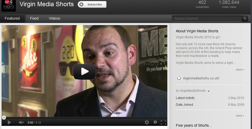
VirginMediaShort Youtube Channel.

Vimeo
The site Vimeo is another popular destination for film maker's to upload their footage. The website is solely based on creation, whereas Youtube has a wider range of products. This means that there may more of a response from videos on Vimeo, as the footage will be more accessible. Vimeo offers a higher quality service than Youtube, meaning that the viewers of the footage will be able to see all of the footage at ease, in the original format in which it is meant to be seen. This means that the video will be able to communicate mise-en-scene more effectively. Vimeo, like Youtube, allows clips to be shared onto a range of sites. However, the range of websites is very limited, especially when compared to Youtube. The website only offers the user an embed code, meaning that the clip may not be able to be shared on popular social networking sites like Tumblr and Twitter. This will have a negative effect on my production as I will not be able to gain as many views and opinions as if it was shown on Youtube. Vimeo has a lower storage allowance than Youtube, meaning that if I want to show many different drafts of the film, I may not be able to. If I use Youtube, however, then this may change. However, Vimeo does appeal to a more creative audience, as opposed to the amateur videos uploaded which have no relevance to the film industry.

A screen shot of a film on Vimeo.


Conclusion
In conclusion, I have decided that my short film 'Flight' will be uploaded onto the popular website Youtube. However, despite the fact that Vimeo appeals to a much more creative audience, I feel that Youtube will be the perfect destination for 'Flight' to be uploaded onto. This is because I will be able to gain a wide amount of views and opinions from users, which can then be used to shape the future re-drafts of my film. Youtube also has a larger storage capacity than Vimeo, which will benefit 'Flight' as I can upload many different drafts of my film, shaped by the feedback given to me by users. Feedback can also be more easily received from other social networking sites such as Tumblr and Twitter, which Youtube can connect to at ease.

Saturday, 17 December 2011

Editing Short Film Analysis

Although I am the cinematographer for my short film, it is highly important that the length of shots is taken into consideration whilst I am shooting the shots required. The use of editing is just as important at conveying meaning to the audience as mise-en-scene, cinematography and sound, although it is more closely linked to cinematography. I will ensure that the editor of my group, Hannah, and I work closely together to ensure that the edited version of the shots I shoot conform to my desired vision. Due to the reasons listed above, I have decided to analysing the editing used within the short film 'Thoughts of a Dead Atheist'. This film has darker themes which link to the social realism genre, meaning that it will be beneficial to my own production for me to analyse, as it will outlay some of the social realism conventions which I may be expected to follow.

Above is the short film that I am going to analyse.

The opening shot of a film is arguably the most important of the whole production. This is because it immediately shows the viewer the themes which reside within the film, and introduce the protagonist to the audience. The opening shot of 'Thoughts of a Dead Atheist' lasts for an extremely long amount of time, amounting to a total of around 20 seconds. The character in the centre of the frame walks away from the camera down a narrow pathway in this amount of time. Although this shot looks visually appealing, and that it introduces the audience to the film effectively, I feel that this shot lasts for a too long duration of time. I will ensure that Hannah edits any of the longer shots I shoot to a smaller amount of time. This will keep audiences engaged with the production and will make them want to know what is going to happen next within the narrative. The following shot, where the man in question encounters another character, lasts for around 8 to 9 seconds. This shorter duration is more effective than the previous 20 second shot, as it keeps audiences engaged by showing them numerous different types of dialogue as the two characters exchange dialogue. Throughout the film shots of around 7 -8 seconds are used. I feel that some of the shots could have been reduced further, as some shots have little relevance to the meaning of the plot yet are shown anyway. This may result in audiences becoming bored whilst watching the short film, meaning that the overall effect of the production is ruined. To avoid this from happening, I will ensure that the shots within 'Flight' are only the necessary amount of time, and that the narrative progression does not drag on for too long. Another important aspect of editing is the use of altering the original colour of the shot. This is shown in the short film above by the use of black and white. However, the red scarf worn by one of the characters is still shown. This shows the importance of this character and hints at the connotations that the colour holds. I will ensure that I work closely with the editor of my film in case she decides to change any of the colour of the shots. We will work together to make sure that any colour alterations are effective.

Social Realism Cinematography Analysis

Fish Tank
Cinematography is a form of visual storytelling. As cinematographer for my short film 'Flight', I felt that it was necessary to conduct some research into the cinematography used within the social realism genre - within which my own film belongs. 'Fish Tank' is a social realist film focusing on the struggles of a young youth, named Mia, who aspired to be a dancer. Although there is no theme of drug culture within 'Fish Tank', it seems to share many of the same themes as my own film. Because of this, I decided to analyse some of the key moments of cinematography within the film, in the hope that it may inspire my own production. I decided to analyse the trailer for the film, shown on the Youtube video below, to gain an insight into what type of cinematography is used within the social realist genre.

Above is the video for the 'Fish Tank' trailer.


The shot shown above is an establishing shot. This effectively shows to the viewer the location within which the film is set. I feel that this is an effective shot as, not only is it visually appealing, but it shows the urbanised area within which Mia lives - the sink estate. It also shows the contrasting visual imagery of binary opposites - by showing the nature scene in the foreground and the urban location in the background. Upon creating my own film I will ensure that 'Flight' contains all of the necessary shots to convey to the audience where the narrative takes place. I will also consider the importance of binary opposites to convey meaning. This may prove to be especially important upon conveying the lifestyle choices that Sophie faces.


The shot shown above effectively shows the struggled lifestyle that Mia leads. The positioning of the frame is very effective, as Mia is shown to be directly in the centre, showing that she controls the progression of the narrative. The ambient lighting behind Mia also holds connotations about her character. The dark clouds with the strip of light behind Mia show that she is struggling to escape a troubled lifestyle. The theme of urbanisation is also effectively shown once more, with the long shot of the city beneath Mia. I will ensure that I used a wide range of nature shots to portray meaning, which will allow audiences to connect and understand my own protagonist effectively.


The next shot that I found to be both effective and visually appealing is the close up of Mia (shown above). The entire shot is purposely blurry, which I feel conveys the themes and the mental state of Mia effectively. The blurred shot represents Mia's confusion as to which path she should take. The blurred trees behind Mia represent the distance between herself and her primal roots. I feel that this effects the audience by allowing them to see the themes which reside within the film. When I create my own production, I will consider using the blurry technique to convey meaning to the audience. However, I may do this with the urban shots which are set within the town location. 


The long shot of the birds flying represents Mia's ambitions of freedom and 'flying away' from the lifestyle within which she currently resides. The colouring of this shot is relatively subdued, despite the blue sky. The way in which the birds move together is visually appealing and shows a binary opposite to the urban area where Mia lives. This shows that colour is an important aspect of cinematography and mise-en-scene as it can be used to portray the character's emotions within the narrative. 

Gone Goodbye
I then decided to conduct some research into a short film shared on the video-uploading site Youtube. Similarly to my Fish Tank analysis, I have picked out the key shots which convey the most effective form of meaning.

Above is the short film 'Gone Goodbye'.


I felt that this shot from the short film effectively conveyed the overall tone of the product. The subdued colours - mainly being dark green, brown and grey, show the isolation of the character in question. The framing of the shot is also effective, as it shows the protagonist being directly within the centre of the shot, despite the long shot meaning that it is difficult to locate him. This shows that he is still in control of the narrative, yet portrays his isolation. I will ensure that I use a similar technique within my own short film as Sophie loses control of her lifestyle. 


This shot continues with the theme of nature shown in the previous shot, yet shows the viewer a closer glimpse of the protagonist. This is the closest shot that we have seen of the character so far, and this occurred at 2:03. I feel that introducing the character earlier within the short film would heighten viewer interest more effectively. However, the mid shot of the man in the foreground and narrative being behind him also looks visually appealing.


The cinematography used in the shot is visually appealing. This is because the shot is divided into two distinct halves - the lake on the left, and the mountain with the man on the right. This shows an equal balance between the two entities, suggesting a balance between man and nature. Seeing as my own short film will deal with the ideas of binary opposites, I feel that using a division of screen framing may be an effective tool to use to convey the theme to the audience. The colour within this shot is also interesting, as the bright yellow balloon is the first thing that the viewer's eye is drawn towards. This takes away from the previous theme of nature dominance explored throughout the beginning section of the film. The yellow balloon also hints at freedom, as it is not tied down. 


Friday, 16 December 2011

Exhibition of 'Flight'

'Flight' will be shown in independent cinemas, as opposed to being shown nationally in large multiplexes, like Vue, for example. This will mean the film being shown on around 30 - 60 screens. The local independent cinema in Kent is The Gulbenkian, otherwise known as Cinema 3, in Canterbury. Below is a screenshot of the film schedule of The Gulbenkian. The Gulbenkian is situated at the University of Kent, meaning that this will be ideal for our target audience, as it aimed at young people and students, as it deals with adult themes. As you can see they show specialist films as opposed to large American blockbusters, which will be the perfect platform to show my film.

The Gulbenkian's (independent cinema) schedule:

The films which are shown at 'The Gulbenkian' cinema not only include popular, English films, but also foreign films, located in Spain and France, for example. The cinema is also located near Canterbury Christ Church University and Kent University, meaning that Film and Media students may be interested in visiting the cinema to cast a critical eye over the films that they are showing. 'The Gulbenkian' also shows films which are not newly released, and have been in cinema for years, such as 'It's A Wonderful Life'. I feel that this is an advantage of the cinema as it allows people to view older films, yet still have the cinema experience.

Vue's (multiplex cinema) schedule:


As you can see, there is a vast difference between the types of films being shown at Cinema 3 and Vue. Vue offer a 3D option of screening, which Cinema 3 does not, yet my film will not be shot in 3D. The multiplex cinema, Vue, shows films which appeals to the fourth quadrant. However, 'Flight' will only appeal to a particular audience - young people who have an interest in drama films, so Vue would not be an appropriate screening choice.

The poster for 'Flight' will also be advertised at the cinema, as people who attend The Gulbenkian will most likely want to see similar films, and my short film falls into that category. This will entice people into seeing 'Flight' as it is more likely to relate to their interests, as opposed to if the poster was placed at a cinema like Vue. I will then proceed to locate the posters in appropriate areas near to the cinema.

The magazine review of 'Flight' will be placed in a specialist magazine such as 'Sight And Sound'. This magazine focuses on a large range of films, from independent, to large American blockbusters. The review being placed in a magazine like Empire would simply not be appropriate as they tend to focus on large, mainstream films which appeal to mass audiences. 'Sight And Sound', however, focuses on delivering articles which appeal to audiences who have a critical eye on films, and perhaps offer an expert view. The 'Sight And Sound' magazine is run by the BFI itself, which means that a large focus of what it covers will involve independent British film. Their reviews offer an opinion which the audience can relate to, yet go into a large amount of detail. The magazines also feature interviews with famous directors and producers, meaning that it appeals to avid fans of the film industry. Because of the fact that it focuses on a large range of films, and the fact that it appeals to critical audiences, we have decided to use 'Sight And Sound' for our magazine choice. 


Logo Ideas

Below are some of the logos I have created for my short film 'Flight'. I have analysed the pros and cons of each, and have eventually decided upon my final logo. To help me create these, I researched logos from existing films . I feel that this research greatly helped the creation of the logos found below.

Logo Idea 1

I feel that this is an effective logo as it has many different appendixes extending from the different letters. This adds a sense of surrealism and fantasy which I want to be displayed as a theme throughout the production. This makes the logo stand out. The logo also holds a slightly worn effect. This I feel will be effective for my film as I want to show how the protagonist of the film is bored of her usual lifestyle. However, I feel that there are too many curls on this logo, and that perhaps the weighting could be thicker so that it is easier to read.


Logo Idea 2

This logo also holds many different curls flowing from the letters, which I think is effective in portraying themes which will be within the film. I like how large the 'F' is in comparison to the rest of the logo, as I feel that it will draw people's attention. However, I feel that the logo would need to be larger and thicker for it to portray a sense of realism.


Logo Idea 3

I like this logo as it has an artistic feel to it. It looks as though it has been created by a paint brush, due to the brush strokes and paint flicks which are shown. I like this as it is though it has been created by a character within the narrative itself. This also gives an impression of age, and suggests that the production will focus around a young person. However, I feel that the logo should be thinner, and that the letters should be placed closer together to show a surreal element.

Logo Idea 4
I feel that this font is effective as it looks as though it was hand-written. It could even be hinted at within the narrative that Sophie herself wrote it. I also like how the font is slightly slanted, and looks as though it has been hastily written. I also like how all of the letters, except for the beginning 'F', are connected.


Logo Idea 5

I feel that this logo is effective as it looks as though it has been written by a type-writer. I feel that this is edgy and inventive, as not many logos which I have researched possess this quality. I also like how the letters appear to be slightly worn, which will be representative of Sophie's lifestyle. However, I think that the letters could be placed closer together as I think that they are too spread out.

Final Logo

As a group we decided to use this logo, primarily due to the fact that the gracefulness of the font coincides with the dance sequence at the beginning of the film. We all felt that the fact that the logo looked hand-written was very effective and it more likely to involve the audience in our short film.

Logo Analysis

I have decided to research and analyse different logos within the genre of film which I am producing. I feel that this will give me an idea of how films within the drama genre portray their logos. The logos which I am analysing are primarily shown on their posters as opposed to actually being within the film, although they could be used for both. Doing this research will enable me to conform or break the stereotypes portrayed when I create my logo for my own production.


Black Swan Logo Analysis


Above is the logo for the drama film 'Black Swan'. This film focuses on themes which are similar to my own production, such as a ballet dancer and the stress which the lifestyle brings. This is why I feel that analysing this logo will be beneficial in my research. I feel that the typography of this logo is quite effective, as the individual letters line up, reflecting the themes which are presented in the film of perfection. However, the logo does not grab my attention and is relatively plain, as it has no distinguishing features about it.


Fish Tank Logo Analysis


This is the logo for 'Fish Tank', which is also about an aspiring young dancer. The logo immediately suggests a sense of youth within the filming, giving the viewer an idea that the film will focus around a young person. This is shown through the use of bright blue and pink colours. The logo is in a sans-serif font, as it does not have any small appendixes coming out of the 'feet' of the letters. This shows that the film will be set in a modern time period. However, I feel that this logo is uninteresting as it lacks any interesting features which will make the audience remember it.


The Departed Logo Analysis

The colours used in this logo are very dark, a mixture of black, grey and blue. The font itself suggests that it will be set in a modern time period, due to the large block letters. The fact that the word 'The' is centred in the middle of the logo certainly draws attention to the film name, yet it almost looks messy and makes the logo difficult to read. However, this could be intentional and signify a sense of distortion, as suggested by the name of the film itself. The hole in the top left of the 'D', to me, suggests a bullet hole, emphasising a theme of violence which may run in the film. I feel that the colours used are effective in portraying genre.


War Of The Worlds Logo Analysis 


The film 'War Of The Worlds' does not focus on one character, but rather as the world as a whole on an epic scale. This I feel is reflected effectively in the logo of the film. Each of the words stands out, and almost appears as it is coming out of the screen at the viewer, involving them into the film before they've even seen it. The fact that the unimportant words - 'of the' are smaller is effective as it allows the audience to focus on the key words within the title. However, I feel that colour could have been used to portray more meaning, and perhaps the levelling of each of the words could have been moved to make the logo not as regimented.

Dirty Dancing Logo Analysis

This film also focuses on themes regarding dancing. I feel that this logo is effective as it looks like it has been scrawled out by one of the characters within the narrative, which immediately involves the audience within the film. I like how the logo is slightly slanted, as it adds to the effect that it has been written down. It also appears to be edgy and different. However, I feel that the dark red colour is not very appealing, and that perhaps a brighter colour could be used to grab people's attention and make it stand out.


Scarface Logo Analysis

The film 'Scarface' focuses around narcotics, which will be included within my own short film. The logo I feel is quite basic. However, the large font suggests the drama genre, and the colour of red holds connotations of blood and violence. The colour is also very eye-catching. I feel that the logo could be improved by a different alignment of letters to make the logo stand out even more.

Thursday, 15 December 2011

Stereotypes of the social realist genre

I have to decided to investigate some of the stereotypes of the social realist and drama genres. Doing this, I will be able to see how to make my film relate to audiences and be as realistic as possible, and also how to break the established stereotypes and make my film be unique.

Some of the key stereotypes of the social realist genre are:

  • To have high tension sequences, where the protagonist's life is in danger.
  • To feature many dark and dingy locations.
  • Low lighting.
  • To be located in an urban area.
  • To focus on real issues within today's society.
  • To feature graphic scenes of death or violence.
  • To feature modern music.
'Flight' will conform to some of the expected stereotypes outlined above. It will be located in an urban area for most of the film, although the middle sequence is to be full of beautiful nature shots. There will be binary opposites between an urban setting and a nature setting, meaning that the film will break the stereotype some-what, and is more likely to be remembered by audiences. The short film will conform to the stereotype by featuring many dark locations. As cinematographer, I have decided to have a lot of dark settings to portray the tone of the film more clearly to audiences. Doing this will also comply with what is expected from a short drama film, and will make the overall genre stand out. 'Flight' will also focus on real issues within today's society - drug use in youth. It is a key factor which, I feel, isn't being focused on enough within the media, so it is important to portray this through the genre of the production. However, the film will not have any scene of death, violence, or high tension, due to the fact that we want youths and teenagers to see the film, as the narrative focuses around them. This will mean the film having a '15' certificate, so we have to comply with the guidelines these age groupings hold. 'Flight' will also not feature modern music, as we hope to either create our own sound using the facilities available to us on our editing software, or use classical music for the dance sequence.

Overall, I want 'Flight' to both break the stereotype - mainly through use of location and sound - and conform to it - by having a dark tone which resides with the audience. Blending the stereotypes will make the film unique and appealing, and will also make it seem socially realistic.