My media product utilises many different established forms and conventions of the genre. However, it also challenges many different expectations which were raised by the audience which I found in my research and planning stages of my product. Exploring real media products was extremely beneficial to the production of Flight as it allowed me to gain an insight into what audience members expect of the particular genre which Flight fell into.
Upon beginning the planning and research stages of creating my short film, I explored many different short films and one music video which fitted into the social realist genre. This gave a clear outline as to what I should follow upon creating my own film production, yet also allowed an insight into conventions were available for me to break in order to effect audiences and viewers most efficiently. This meant that, through exploring films which dealt with many of the same themes as Flight, that I gained a wide view on how the themes which lay within many social realist films are presented. Different shots and ideas were used as inspiration for my own product, as I wanted to ensure that the film looked as professional as possible. However, many ideas were challenged - and shots which dealt with the same theme as my own were not used.
I also looked at many different posters and magazine review pages which were professional-looking and informative. This meant that upon creating my own ancillary products that each of them would look professional and would be able to be displayed individually - as opposed to being shown as a trio. Looking at the professional products meant that my products would be as effective as possible, and that I would be able to challenge established conventions that they held, to draw as much attention to the products as possible.
'Flight' - Short Film.

'Black Swan's location shown on the left, 'Flight's shown on the right.
One of the most influential films to my product was the award-winning film 'Black Swan'. Although not a short film, analysing this product greatly helped the production of my own. 'Black Swan' dealt with the two key themes as my own film - a struggling dancer who resorts to drug use. The most beneficial part of analysing 'Black Swan' was the use of location. We used a similar location to the one portrayed in 'Black Swan' as we felt that for a ballet dancer, the expectation convention would be for our protagonist to train in a professional-looking dance studio. Because of this, we used the dance studio on-site at Sandwich Technology School, to give the desired effect of a practising ballet dancer. I also noticed that much of the shot in 'Black Swan' (shown above) was dominated by the use of mirrors. Because of this, I, as cinematographer, decided to include numerous shots of the wall of mirrors on location. However, I decided that the lighting of the shot should be substantially lighter and perhaps more colourful than 'Black Swan's' dance studio, as this would make it more visually appealing to the viewer and it appeals to a younger target audience, as typically the brighter colours appeal to teenagers and young people.

'Flight' shown on the left, 'Black Swan' on the right.
I continued to analyse the dance scene within 'Black Swan' further, as this would benefit my production even more-so. When the protagonist began to dance in the film, the camera movements seemed to follow her movements, and focused the framing entirely on her. Because of this being effective at allowing the viewer to connect with the character, I too centred most of the framing around Sophie - the protagonist of 'Flight'. Because of this I purposely centred Sophie within the frame for the majority of the dance sequence. This clearly shows that audience who controls the narrative of the short film. However, one convention I noticed was that the face of the protagonist of 'Black Swan' was continually shown throughout the sequence. I also explored many different short films which focused on a struggling dancer, and this theme appeared frequently. This showed that audience members expected to see the protagonist's face throughout the production. I thought that Flight should challenge this convention, to make it stand out against similar films and short films. Because of this decision, much of the dance sequence focuses on Sophie's silhouette-like legs. This raises a sense of ambiguity about the character as the audience are yet to have fully seen her face. Challenging this established film convention, I feel was effective and beneficial to the overall production as it engages audience interest early within the film.

'Black Swan' shown on the left, and 'Flight' on the right.
There was one particular shot within the film 'Black Swan' which I felt was particularly effective. This is the shot shown above. The camera tracks the dancer's movements as she travels across the dance floor. I explored other films which focused around dancing, and they too used repeated fragmentation of the dancers' bodies to portray their aspirations. I repeatedly used this within Flight as it showed Sophie's determination and struggle at becoming a successful ballet dancer. However, unlike in 'Black Swan', the camera in my own production remains stationary, as the editing cuts to different shots of Sophie's attempts of dancing. This showed the repetition of Sophie's lifestyle, and how determined she is to achieve her dream. Another convention which was discovered upon watching 'Black Swan' was the costume in which the character is dressed. She is dressed in a typical ballet leotard and ballet shoes. From looking at many other ballet films - such as 'Ballet Shoes', it was clear that the dancers wore the expected costume. However, to contrast the expected convention of costume to show that Sophie is only an aspiring dancer - not a successful. Also, breaking this established convention creates a different effective on audiences and makes sure that the film itself is remembered after viewing due to the differences of expectations.

Above is 'Fish Tank' on the left, and 'Flight' on the right.
Lens flares are used in a majority of social realist films. I noticed that this method of cinematography was used repeatedly throughout this film. The lens flare looks visually appealing to the audience and effectively mixes the two locations used throughout our film effective - the nature scene by the river and the urban scenes with the drug exchange. I decided to include some blinds into the shot to portray the theme of imprisonment and to portray Sophie's trapped environment. However, our characterisation is completely different to the one portrayed in 'Fish Tank'. The contrasting light and darkness in the frame is also effective, as it portrays Sophie's blending of two lifestyles. This framing - as shown in the real media product 'Fish Tank' - was effective, so I decided that it should be included within our own short film.

To the left is 'Fish Tank' and the right is 'Flight'.
We used the technique of blurring the footage. This was found in 'Fish Tank'. The blurred lights of cars behind the protagonist - Mia - show the urban lifestyle which Mia leads. I thought that this looked visually appealing and also showed the urbanised area within which the film is set. Due to this being both pleasing to the eye and showing the themes which lay within 'Flight', I decided to use this technique upon analysing my own production. The lighting within the shot is also relatively low, showing only the protagonist and the slightly blurred background. This shows who progresses the narrative and allows the audience an insight into whom they are expected to connect with. However, I wanted to use a darker colour pallet than the one portrayed in 'Fish Tank', as it shows a contrast between the first and second half of the film. Using contrasting ideas if also a convention within social realist films, as they portray a contrast in lifestyle.
'Fish Tank' on the left, and 'Flight' on the right.
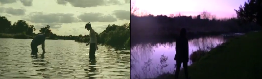
The real media product 'Fish Tank' used lots of locations which featured nature within the film. The river/lake scene was particularly effective and visually appealing. It also holds connotations of the protagonist within the narrative taking a different path in her life, which is an effective tool of promoting the narrative. The silhouette effect also looked visually appealing, as it shows the contrast between man and nature, and the conflicting of lifestyles and identity within Sophie that the narrative of 'Flight' deals with. Because I liked this effect, as cinematographer, I decided to include a river within my own production. This convention within a real media production benefited the creation of my own short film, as this location was very effective, and successfully portrays the scene within the film where Sophie is contemplating purchasing drugs. The trees within the shot also emphasise the nature location which I found was occasionally used within the social realist genre, and allows me to mix the urban and natural lifestyles. This represents an extended metaphor of the choices of lifestyles that Sophie faces. Binary opposites are a key convention of the social realist genre, particularly in regards to young teens, as it shows the difficult realities that young people have to face. Therefore, I felt that this was necessary to include within my own film. As you can see, however, the colours are drastically different. This is because I wanted the purple colour to represent information through the form of mise-en-scene. This adds a surreal element which links to the theme of the potential drug use which takes place at the very end of the narrative.

The location with Ed Sheeran's 'A Team' on the left, and 'Flight' in the right.
Within the music video 'The A Team', I found that the camera positioning of the young woman on a bench was effective. The bench helds connotations of homelessness and inner reflection. The framing was also in the centre of the shot, with a bright light above the character. I felt that this shot looked visually appealing and given an insight into the lifestyle of the character in question. Because of how effective this was in a real media product, I decided to implement a similar shot into my own media film. The trees on either side of the shot also portray the mixing of urbanised and natural lifestyles, showing a binary opposite within the film. However, unlike in Ed Sheeran's music video, I decided that it will not hold the theme of homelessness, as it was not relevant to the narrative of my film. To combat this issue, I had the character sitting in an up-right position.

Ed Sheeran's A Team Music Video shown on the left, and 'Flight' on the right.
One key conventions of the social realist genre is to portray an isolated character - particularly if that character is a teen or a young adult. This shows the state of youth within society today, and how this issue needs to be fixed. Upon viewing Ed Sheeran's 'A Team' Music Video, it was clear that isolation was a key convention which was used throughout the footage. As you can, I used a shot of our protagonist walking down a street - similar to that of the one within the 'A Team' video. I felt that this was effective as it shows a literal distance from the audience - portraying Sophie's isolation. However, although the black and white images used in the music video is effective, I felt that it would be more beneficial to my production if colour was used. Many social realist films use colour within their productions, so I used decided to conform to what audiences would expect. The colour within 'Flight' also makes the film more visually appealing. Due to these reasons, upon editing, we decided to keep the film in it's original colour. We used a mix of urban and natural locations within 'Flight', which was also a theme found within Ed Sheeran's music video. I decided to blend these two locations as urbanised areas are a key signifier of the social realist genre. However, I felt that nature shots, as shown in the music video in my research, was effective, although it may not necessarily be what audiences expect from the social realist genre. This will mean that the viewer will remember the film after it due it the unique aspects which it holds.

The drug exchange for 'The A Team' on the left, and 'Flight' on the left.
The drug exchange scene within 'Flight' is one of the most pivotal scenes within the entire short film. Because of this, I decided to analyse the shot used within the music video 'The A Team'. As you can see, there is a high contrast between the hands and the background, which portrays the importance of the scene within the narrative. However, the difference between 'Flight' and the real media product, is that I show the two characters - Sophie and the drug dealer - as silhouettes, and make the main focus the transaction of the hands. Although the bad of drugs is visible within the scene, it is not as blatant as the transaction within 'The A Team'. This is because I wanted to ensure that the film remained within it's 15 certificate, so that youths - who the film is collectively aimed at - will be able to view it in art-house cinemas. The dark lighting and dark colours within an urban location are a key convention of the social realist genre, which is found in many short films. Due to this, I decided to comply with the conventions which would be expected by viewers and audiences. This would mean that they would not be alienated by the shots and lighting within the film.

'The A Team' on the left, and 'Flight' on the right hand-side.
There is one key difference between the real media product 'The A Team' and my own short film is that the drug use is not explicitly shown, whereas in the music video it is. I decided to keep the idea of drug use ambiguous, as this would keep audience's questioning the ending of the film. Another reason for not using the convention of showing drug use and the effects is that I wanted the film to be seen by young audiences, as to raise awareness for the issues of drug culture. The shot of the door slamming shut with the red sign on the door adds a sense of finality to the narrative - letting the viewer know that it is over - yet it also remains ambiguous in regards to the drug use theme within the film. However, the use of the colour red on the door does conform to the idea of danger, used throughout many films and short films - not just in the social realist genre. Using this use of mise-en-scene allows the audience to connect with the themes which lay within the film and see the dangerous effects of drug-use.
Below, I have used to technology available to me on the website 'Youtube' to analyse the final draft of my short film. This means that as you watch the film, the annotations depict the conventions which my film conforms to or challenges.
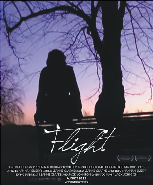
'Flight' - Poster.

Above is a screen shot of two film posters which fall into the drama/social realist genre.
The two real media products shown above - the poster for 'Tideland' and the poster for 'The Red Machine', both use conventions within the social realist genre, although 'Tideland arguably falls more into the drama genre than social realist. Each of the films deals with themes which reflect a true eye on society, despite other themes being involved. As you can see, each of the real media products deals with the idea of contrasting images/colours. 'Tideland' has a distinct difference between the two halves of the poster. The top half uses dark colours, primarily black, whereas the lower half is light blue. However, despite the lighter colour on the lower half of the poster, it still holds negative connotations, as the tree appears to be dead. This portrays to the audience the dark themes which lie within the narrative of the production. I used the convention within this real media product upon creating my own poster for 'Flight'. As shown below, the top section of my poster is dominated by light purple colours, whereas the lower section is completely black. Not only does this make the film visually appealing (the white text on the black background looks more appealing to the eye than if it was on the purple section), it also shows to the audience that binary opposites will run throughout the short production. The shows the two colliding themes of both the ballet dancing aspirations and the temptation of resorting to drug use. I also used the convention of using the dead tree as a signifier to the negative connotations that drug culture has. However, unlike in 'Tideland', I decided that there should be more of a blend between the two sections of the poster. This will make it more appealing to view and will show the blending of the two lifestyles that Sophie may chose to lead. The logos on both 'Tideland' and 'The Red Machine' contrasts with the colours on the background. This allows the audience to immediately see the logo, and it grabs their attention through the use of contrast. I decided to use this convention upon creating my own poster to ensure that it is effective. 'The Red Machine' also has a contrast in colour, as there is a difference between brown and black. This is still effective, although not as much as 'Tideland' as the colours themselves are both quite similar. Another convention of the social realist/drama genre is that they show the main character on the poster itself. This is portrayed in both of the posters shown above. Putting images of the main character on posters allows the audience to immediately see who they are expected to connect with. Because of this being effective, I decided to use this upon creating my own poster. However, I wanted to use an artistic image that also represented the themes which resided within the film itself. Because of this, the silhouetted image shown below was chosen. Although not a convention of the social realist genre, this raises a sense of enigma about my protagonist.
Above is the poster for 'Flight'.
Overall, I am pleased with how my poster both utilised and challenged conventions of the social realist genre. To ensure that I was aware of the expected conventions upon creating my own product, I analysed a range of poster products. I feel that challenging these conventions was effective, as my poster has a darker feel than many real media products. However, it uses the same ideas of having a large logo and showing the protagonist.
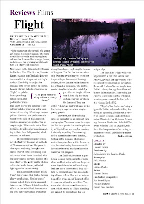
'Flight' - Magazine Review Page.
Upon creating my magazine for my short film 'Flight', I ensured that I followed the conventions which the reader would expect to see upon reading a review of a film. The layout of the film strongly followed the format which was shown frequently within the 'Sight And Sound' magazine, which is where I wanted my review page to be show-cased. The use of one or two images was shown frequently within review sections of magazines. Because of this, and because I wanted to give readers a small insight into the film itself, we decided, as a group, to put a large image at the top of the review. This meant that readers could look at the image first, and then read the review about the film afterwards. This seemed to be a convention that was shown in many different real media products, so I decided to utilise this to it's full potential by choosing a moment within the film that was both visually appealing and that had an impact on the narrative to choose as the image to use. One convention within many 'Sight And Sound' reviews was to have the title of the film relatively small. However, upon looking at a more widely popular film magazine, such as 'Empire', it was clear that the titles of the review pages were much larger. I preferred this, so I included it within my own magazine product. Having a larger title would grab the reader's attention more effectively and would ensure that they remembered the name of the film. Another convention used within the 'Sight And Sound' magazine was to right about not just the narrative of the film, but also the cinematography and mise-en-scene used throughout. Because of this, upon writing the review of the film, I decided to focus particularly on individual shots and scenes that had an impact on the over-riding theme of drug use. As shown below, a particular quote was embedded into the review. This was used in many different magazine review pages, particularly within 'Sight And Sound'. The quote selected in each of the reviews tended to be one of the most in-depth quotes throughout the review, yet also promoted the film (or had the opposite effect) to the reader.
My Magazine Review Page:
A magazine review page for a real media product:
It was also necessary to ensure that the content of the magazine review page followed the conventions presented by 'Sight And Sound' magazine. To do this, I ensured that I conduced an extensive amount of research into real media products which focused on magazine review pages. I focused on the review of the short film 'Karma' which was found within an issue of 'Sight And Sound' magazine. It was clear the the information about the short film was given at the very beginning of the review. This information included the director, the release date, the film certificate and the length of the time that the film ran for. I thought that this convention of the real product was effective, so I decided to include it within my own review page. This meant that the reader could easily see the basic information about the film, and that the reader would see what they expected within the review.

The next convention I explored of the magazine review page was the introductory paragraph. From looking at the very first paragraph of the 'Karma' review, it was clear that it held all of the relevant information that would intrigue the audience. For the real media product, the text included information which generally focused on naming the director and giving the reader some narrative information. I followed this convention upon creating my own review, although I tended to focus more heavily on narrative.

As shown by the comparison of the two images above, the magazine review page for 'Flight', uses many of the same conventions as real media products. Primarily, the main use as the use of a large image at the top of the review itself. However, the review page also challenged some conventions, as the credits listing (shown on the right hand-side of the image above), was significantly smaller within my own product. This meant that there was a larger amount of space for the review on the page.
Overall, I am happy with the amount of research which was conducted into real media products. Doing extensive research in my planning and research stages meant that upon producing my own products, I was able to have a wide range of knowledge into the media industry available. This meant that I could choose within each area what conventions of the product I could utilise or challenge to my own advantage. I feel that this allowed a greater effect to be produced from each of the products, either individually or as a trio.
No comments:
Post a Comment