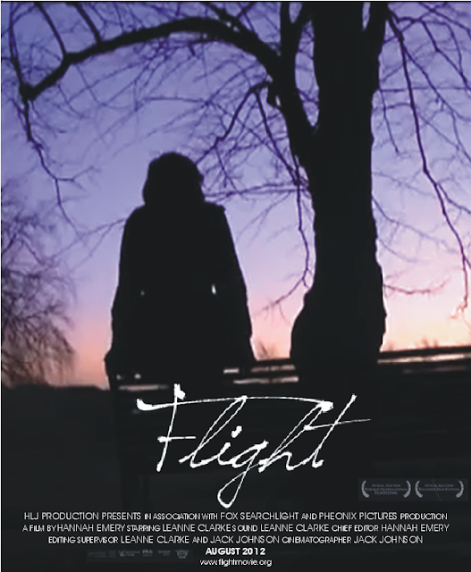
Above is the final choice of poster design to advertise our short film 'Flight'.
We altered Leanne's design of the poster to ensure that it was effective at gaining the attention of our desired target audience. The logo now blends in with the rest of the poster, as previously the colour behind the word 'Flight' did not match the colour of the rest of the still. We also added awards that the film has won, due to the fact that this seemed to be a reoccurring theme when we analysed posters which dealt with similar themes as our own production. Overall, I am very happy with how our final poster turned out, as I feel it incorporates a good summary of what the narrative of 'Flight' is about. The fact that Sophie, the protagonist, is a sillhouette portrays the surreal aspects of the film, and how distant her character is from dominant ideology within society. A large bulk of the poster is shown to be nature, which is also very important within the narrative, as Sophie is shown to be continuously contemplating her actions in regards to drug use, and while she does so she views nature with a thoughtful eye.
I decided to ask members that are following my progress on the social networking/blogging site Tumblr what their opinions were of the poster. To do this I firstly posted a link to the film and asked them to leave a message in my inbox with thoughts and feelings about it. I also visited many professional blogs on Tumblr which focused on media products, and left a series of questions in their ask-boxes. This was to gain a view on the poster product which could be beneficial to the production. The questions which were asked can be seen in the screen shot below.

I also asked the same questions to my followers on the website. I have collected the responses from both followers on Tumblr and from media blogs to my questions in the form of a series of graphs.

As you can see from the results shown above, the strongest aspect of the poster is widely regarded as being the colours which were used. The second highest response was the image of Sophie. I agree with the response which was given, as the mise-en-scene which was used looks visually appealing.

The vast majority of responses shows that most people feel as though the poster does reflect the genre that is within 'Flight'. Only one person was 'Unsure', meaning that the poster was generally successful.

Nine out of ten people found that the poster looked to be visually appealing. I questioned the person that said 'No' via the social networking site Tumblr. They said that the image was too blurry which deducted from the general feel and effect that the poster is trying to connote.

Most people said brighter colours should perhaps be used to show meaning. I agree with the response as the vast majority of the poster is the colour black, which could potentially be quite dull. However, the colour of black connotes the dark themes (regarding drug use) that reside within the narrative of 'Flight'. Other suggestions included a high quality image, which could be beneficial and a bigger logo, which could be used to grab people's attention.

The clear result of this question was that the poster connoted the 'Social realist' genre, which is exactly what I hoped to achieve from creating this poster. Drama, Fantasy and Horror genres had two responses each, suggesting other themes which were not intentional lay within the poster. To combat this issue I will have to ensure that my magazine review play clearly shows the social realist genre.
No comments:
Post a Comment